Note: We’ve now released our Q4 2024 Cycle Forecasts for sale to everybody. You can read more about these Forecasts here. Access all different asset Forecasts at www.cyclesedge.com. Our Founding Members have already been emailed the entire set. If you’re a Founding Member and haven’t received the Q4 2024 Cycle Forecasts, please reach out to us via Substack or the Founding Member Discord Server (preferable).
A lot of people look at Technicals, Market Internals, Fundamentals, and Macro, but often forget to confirm these signals with Intermarket Analysis.
Intermarket Analysis is a study of how different assets/sectors move in relation to other assets/sectors. This helps in providing further confluence/warning signals in the market.
We’ll go over 8 key intermarket charts that all our members should know because it’ll help increase the odds of being on the right side of the market.
This will cover a range of assets like Gold, Silver, Copper, Oil, and Bitcoin.
By the end of this article, these intermarket charts should provide you a significant Edge (especially when used alongside our Cycles Forecast). Let’s dive in!
Gold And Real 10-year Treasury Yield
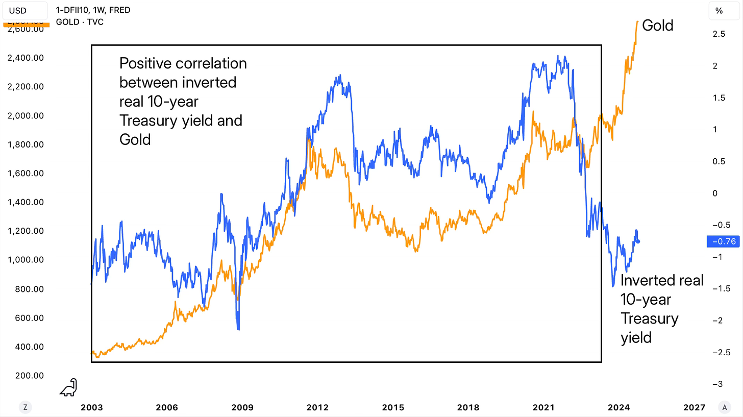
Gold has been inversely correlated with real 10-year Treasury yield since at least 2007. Real 10-year Treasury yield is simply the 10-year Treasury yield minus 10-year inflation expectations.
The orange line below is Gold and the blue line is the inverse real 10-year Treasury yield. So, when the blue line is rising, it means the real 10-year Treasury yield is falling and vice-versa.
Interestingly, since late-2022 this relationship has been diverging where the real 10-year Treasury yield has been rising, but Gold has also been rising too.
A lot of this can be attributed to:
1) Investors’ inflation and interest rates expectations
2) Central banks around the world buying Gold at record levels
3) Geopolitical tensions that have been on the rise
However, this divergence does signal that at some point either Gold is going to pullback sharply OR real 10-year Treasury yield is going to decline i.e., the blue line would rise (either through falling 10-year Treasury yield or through rising inflation expectations).
Silver And US Dollar
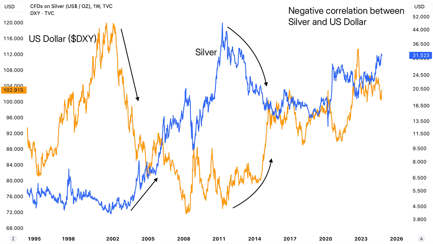
Silver has been inversely correlated to US Dollar ($DXY).
When USD decline, it’s typically a tailwind for Silver and when USD rises, it’s usually a headwind. This relationship particularly holds true on the higher timeframes, like weekly and above.
Silver investors should monitor this on a weekly basis at least because when USD and Silver are both moving in the same direction, it usually means that one of them is lying.
Our next 6 intermarket charts are going to explore a lot of other key assets like Copper, Oil, Bitcoin, Small Cap Stocks, Precious Metals, while considering (and explaining) factors like ISM Manufacturing PMI, Chinese Yuan, and different ratios.
These 6 charts are a must know and have for all our Premium Members. Internally, we monitor these (and more) on a regular basis when looking at the intermarket analysis component of our analysis.
Find our membership cost/benefits below. If you’re serious about Making Money (our primary goal at Cycles Edge), then the Premium Sections are key for you!


