The Market's Character: "Walking on Eggshells before Easter"
Macro Analysis: Investors are walking on eggshells right now, waiting to see if the systemic banking issues spread to other banks and moreover turn into systematic issues that affect the greater market and economy. On the other hand, we are nearing a strong seasonal time as the Easter Rally could be days away. The verdict is not out yet, and there are observable points on both sides. The collapse of Credit Suisse and the recent spike in credit default swaps (CDS) for Deutsche Bank and other banks hint that more banking issues could occur in weeks to come. However, St. Louis Fed President Jim Bullard stated last week that there is an 80% chance that financial stress abates and that the chance of a new global financial crisis is low.
Financial stress is high as evidenced by the MOVE Index (bond volatility index). You could see from the chart below that the uptrend in the MOVE Index correlated with the decline in both high-yield bonds (HYG) and the S&P 500. For now, both bonds and stocks seem to have found support. In days to come, it will be interesting to see if news of another bank failure takes down the market or if the market starts ignoring this type of news.
Business Cycle: Despite the negative macro environment, the offensive sectors (technology, communications, consumer cyclical, and industrials) are performing quite well this year and show relative strength compared to both the S&P 500 (up 3.48% YTD) and the defensive sectors (utilities, consumer defensives, healthcare, and energy).
It is possible that after a tough 2022, the market is bottoming as the economy will continue to fall into recession. The technology, communications, consumer cyclical and industrial sectors could continue to lead the way.
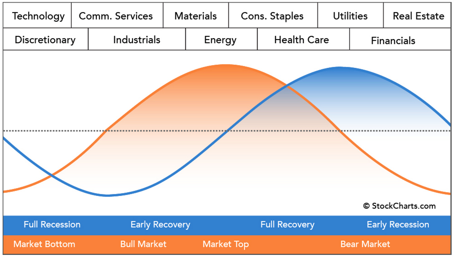
For the entire stock market, however, things may not be so easy. We could be in Stage 1 of the Business Cycle, where stocks and commodities fall with the economy. Meanwhile, bonds rise as interest rates come down to soothe a hurting economy. The chart below is a diagram of how the Business Cycle usually occurs.
In the chart below we could see that this Stage 1 scenario is possible. The SPX is wavering and seems to have issues finding its footing. Commodities (DBC) have been in a downtrend since June 2022. The aggregate bond index (AGG) appears to be perking up and finding buyers despite the banking industry's woes.
In the case that the market does fall…how far can it fall? Looking at the valuation chart below (courtesy of Fast Graphs), the SPY (an S&P 500 ETF) at 15x the blended P/E ratio, or $325, could be reasonable support from a valuation perspective. That would translate to about $3,250 for the S&P 500.
From a technical perspective, I am always surprised to see how often the market touches yearly Fibonacci pivot points (purple lines in the chart below) throughout the year. You could also see how the drops in 2018 and 2020 touched support pivot points before reversing. For 2023, there are support pivot points at $3,543 and $3,223, and $2,723. Combining the valuation chart, there seems to be a confluence in the $3,223 to $3,250 area.
Intermarket Analysis: The Intermarket picture looks like a page out of an Intermarket Analysis textbook. Inflation causes interest rates to rise, however at some point, when high-interest rates break something in the economy, rates come falling down to undo the damage that was done. This time around it’s the regional banks that may have broken. The 10 and 2-year rates are falling fast in anticipation of a Fed Pivot, which is usually done when something breaks. The US Dollar is also falling as lower rates make the US Dollar less attractive.
Lower rates and a lower US Dollar is creating a supportive environment for growth and tech stocks. The chart below is a weekly relative chart of Growth (IWF) / Value ((IWD). Growth is showing significant relative strength under the declining rates and declining US Dollar regime.
Technical Analysis: From a technical perspective, the S&P 500 (SPX) is in a state of indecision. Price is currently above the Conversion Line (blue line), which could be a sign of a new uptrend, especially if it gets above the Base Line (red line) at $3,973. Price is also sitting on the S1 Support Pivot Point, and the MACD indicator made a bullish crossover, both factors are bullish. On the bearish side, the price is right under the cloud, signifying resistance up ahead. The CCI indicator shows that a sizable downtrend occurred, but since it is not yet above the 0 mark, an uptrend has not yet begun in earnest. The Money Flow Index (MFI) Indicator shows that money is still flowing out of the market.
Taking the Ichimoku Cloud away, we could see that price is forming a triangle, which is a consolidation pattern showing indecision. Moreover, the middle of the triangle is formed right over the Volume Profile Point of Control (POC), which is the point where most shares were traded. The POC is serving as an equilibrium point for this sideways consolidation. Triangles eventually break in a certain direction. Perhaps the Cycles and Seasonality factors (covered later) could provide a hint as to which direction it goes.
Market Internals: The market internals are also showing a mixed picture.
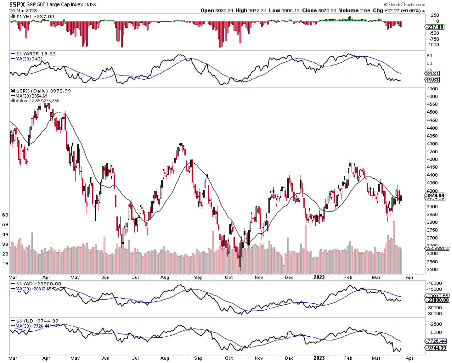
Breadth and Volume are showing weakness but could be at the point where a reversal occurs. The NYSE New Highs/New Lows study ($NYHL) shows that there are still more new lows occurring, telling us it is a tough time for stock-picking right now. Only 19.63% of NYSE stocks are above the 50-day moving average ($NYA50R), which is known to be an indicator of stocks being in an uptrend. The Cumulative NYSE Advance-Decline Line ($NYAD) and the Cumulative NYSE Advance-Decline Volume Line ($NYUD) are both in a downtrend under their 20-day moving average. On the bright side, the $NYA50R, $NYAD, and $NYUD appear to have hit support levels and have stopped their decline. Perhaps a reversal is coming next.
Volatility, as measured by the VIX, appears to have topped as it reversed back under the 20-day moving average (black line). The MACD indicator also made a bearish crossover, hinting that a continued downtrend for the VIX is possible. This would be bullish for the stock market.
Sentiment is a mixed bag. The Fear & Greed Model shows that more downside is possible.
1 Source: Sentimentrader.com
However, the Smart Money/ Dumb Money study shows that Smart Money is not waiting to buy and they are doing so rapidly, as Dumb Money continues to sell out. This could be the Smart Money preparing for the Easter Rally.
2 Source: Sentimentrader.com
Despite the negative systemic risk news from failed banks, it may be hard for the market to go down more. This is because sentiment is too negative. The AAII Bulls vs. Bears indicator is at a negative extreme. Looking at the past, when this occurs, bounce usually happens. Also, the Put/Call Ratio ($CPC) is above 1, signifying that there were many put buyers. A surge of put buyers historically led to a short squeeze or bounce, as the market has a counter-consensus tendency and does not like to pay people. When everyone buys puts betting that the market will decline, the market usually goes up so the put buyers don’t make money. When there is a surge of call buying betting the market goes up, the market usually pulls back so call buyers don’t make money. This is driven by: 1) the market’s tendency to make most people wrong and 2) the tendency for big banks who sell options to make money by not paying their counterparties.
The chart below is a Max Pain chart that plots open interest for call and put options. For the 3/31 expiry, there are 2.63x as many puts vs. calls. Since Wall Street doesn’t want to pay all the put options, the spikes in put option open interest will tend to form “Put Walls”, where it is unlikely that price falls below these put wall levels. Note that there are put walls at $390 and $385 on the SPY. On the other hand, there is a call wall at $410, which could be resistance for a possible rally this week.
Oscillation Cycle: Below is the chart of the Oscillation Cycle for the S&P 500:


